Our Week in Charts series showcases charts that help explain a rapidly changing world. From artificial intelligence to population transitions and shifting trade routes, the forces reshaping the global economy are accelerating—and intertwining. This year’s charts reveal how innovation, demographics, and geopolitics are redrawing the contours of growth.
AI and tech: Evolution and real-world impact
Advancements have moved from frontier innovation to foundational infrastructure. Yet so far, only a small share of organizations is deploying these tools at scale—a signal of both the speed of adoption and the opportunity still ahead.
AI has evolved from a novelty to a widely adopted tool, with equity investments reaching $124.3 billion and AI-related job postings increasing by 35 percent from 2023 to 2024. Despite this growth, McKinsey’s annual tech trends report revealed that only 1 percent of leaders consider their companies’ AI deployments fully mature, highlighting both the rapid progress and the untapped potential of AI technologies.
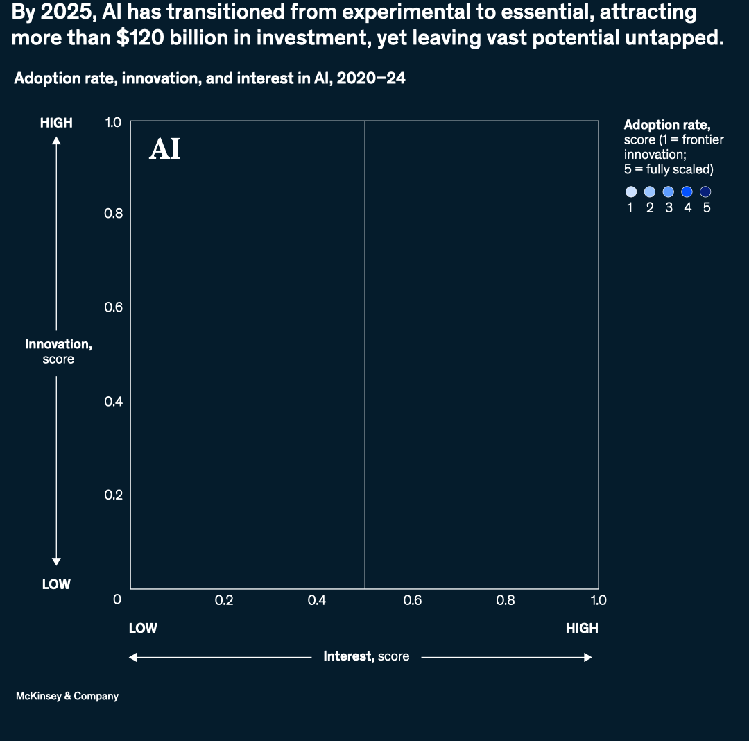
Image description.
A graph illustrates the adoption rate, innovation, and interest in AI from 2020 to 2024. The x-axis, labeled "Interest score," ranges from 0 to 1.0, with "LOW" at 0 and "HIGH" at 1.0, while the y-axis, labeled "Innovation score," also spans from 0 to 1.0, with "LOW" at 0 and "HIGH" at 1.0. Two circles are plotted on the graph, representing the years 2020 and 2024. The 2020 circle is positioned at an interest score of approximately 0.2 and an innovation score of 0.4, with an equity investment of $64.0 billion. In contrast, the 2024 circle is located at an interest score of around 0.9 and an innovation score of 0.9, with a significantly higher equity investment of $124.3 billion. A line connects the two circles, indicating a positive trajectory. Additionally, a legend on the right side of the graph shows the adoption rate score, ranging from 1 (frontier innovation) to 5 (fully scaled), with the 2024 circle corresponding to a score of 5, represented by a dark blue color.
This image description was completed with the assistance of Writer, a gen AI tool.
Source: McKinsey and Company
End of image description.
Companies broadened the scope of their AI use this year. By mid-2025, 88 percent of organizations reported using AI in at least one business function—up from just over half in 2021. The share deploying AI across three or more functions tripled, signaling a shift from pilot projects to operational integration. Although many companies are still in the early scaling stages, AI’s rapid diffusion is evidence that the technology is no longer confined to a single team or task but is beginning to reshape how entire organizations operate.
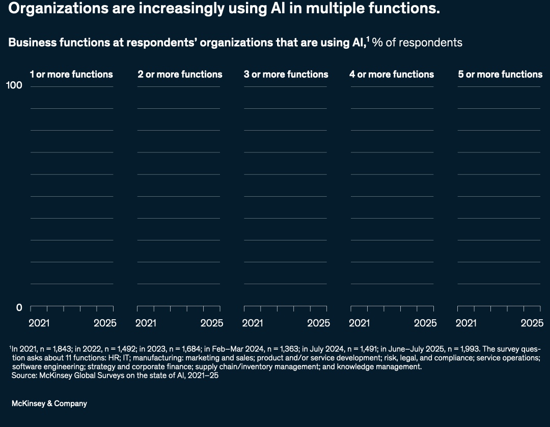
Image description.
A series of five line charts illustrates the percentage of respondents whose organizations are using AI in a specified number of business functions, from 2021 to 2025. The first chart, titled "1 or more functions," shows an increase from 56 percent in 2021 to 88 percent in 2025, with a dip to 50 percent in 2022. The second chart, "2 or more functions," shows a rise from 31 percent in 2021 to 70 percent in 2025, also with a dip to 27 percent in 2022. The third chart, "3 or more functions," indicates an upward trend from 17 percent in 2021 to 51 percent in 2025, with a slight dip to 14 percent in 2022. The fourth chart, "4 or more functions," shows growth from 9 percent in 2021 to 33 percent in 2025, with a consistent 6 percent in 2022 and 2023. Finally, the fifth chart, "5 or more functions," demonstrates an increase from 4 percent in 2021 to 20 percent in 2025, with a low of 2 percent in 2022.
This image description was completed with the assistance of Writer, a gen AI tool.
Source: McKinsey Global Surveys on the state of AI, 2021–25
End of image description.
An area of AI capturing attention across sectors is general-purpose robotics. This field is being advanced by multimodal foundation models that enable robots to understand visual inputs and spoken commands—and then act on them. These new models promise greater dexterity and versatility, a shift that marks a significant step toward more adaptable and capable robotic systems.
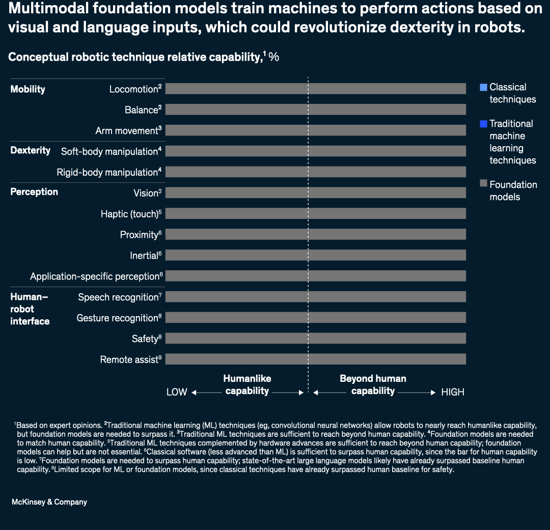
Image description.
A horizontal stacked bar chart illustrates the conceptual robotic technique relative capability, comparing classical techniques, traditional machine learning techniques, and foundation models across various robotic capabilities. The chart is divided into four categories: Mobility, Dexterity, Perception, and Human-robot interface. Under Mobility, locomotion and balance are nearly at human capability with traditional machine learning techniques, while arm movement has reached beyond human capability with traditional machine learning. In Dexterity, soft-body manipulation and rigid-body manipulation require foundation models to match or surpass human capability. For Perception, vision is near human capability with traditional machine learning, haptic (touch) is just below human capability, and proximity, inertial, and application-specific perception have surpassed human capability with classical software. Under Human-robot interface, speech recognition requires foundation models to surpass human capability, gesture recognition is just below human capability with traditional machine learning, safety has surpassed human capability with classical techniques, and remote assist has limited scope for machine learning or foundation models as classical techniques have already surpassed human baseline for safety. The chart highlights that foundation models are essential for certain capabilities to match or exceed human-like performance, particularly in areas such as soft-body manipulation, rigid-body manipulation, and speech recognition.
This image description was completed with the assistance of Writer, a gen AI tool.
Source: McKinsey and Company
End of image description.
In other tech advancements, China has emerged as the world’s largest car exporter, driven by a sharp rise in electric-vehicle (EV) sales. Car exports grew from 0.7 million in 2019 to 5.5 million in 2024, surpassing major exporters such as Japan and Germany. By the second quarter of 2025, EVs accounted for nearly half of China’s passenger vehicle exports, solidifying its global leadership.
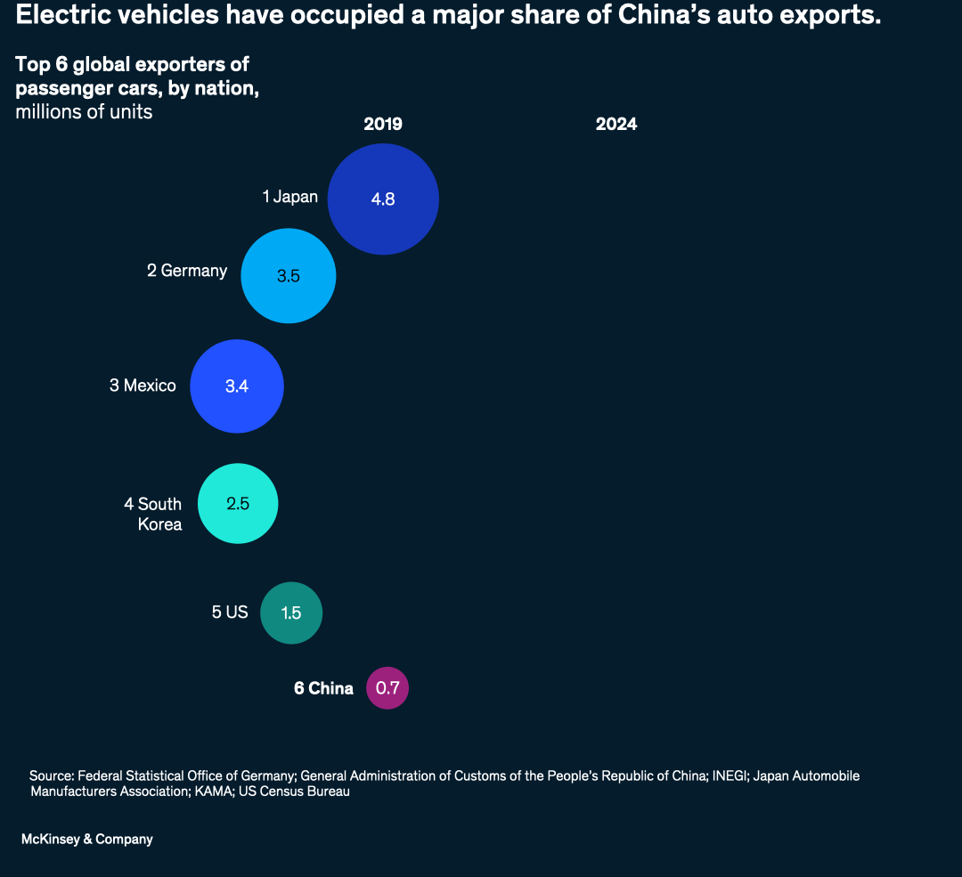
Image description.
A flow diagram illustrates the top six global exporters of passenger cars in 2019 and 2024, measured in millions of units. In 2019, Japan was the largest exporter at 4.8 million units, followed by Germany at 3.5 million, Mexico at 3.4 million, South Korea at 2.5 million, the US at 1.5 million, and China at 0.7 million. By 2024, China became the largest exporter at 5.5 million units, followed by Japan at 4.2 million, Mexico at 3.5 million, Germany at 3.4 million, South Korea at 2.5 million, and the US at 0.8 million. The diagram shows the changes in rankings and export volumes between the two years, with China experiencing the most significant increase and overtaking Japan as the top exporter.
This image description was completed with the assistance of Writer, a gen AI tool.
Source: Federal Statistical Office of Germany; General Administration of Customs of the People’s Republic of China; INEGI; Japan Automobile Manufacturers Association; KAMA; US Census Bureau
End of image description.
People, productivity, and the next workforce frontier
Demographic shifts are reshaping economies faster than countries and businesses can adapt. Meanwhile, workforces are reconfiguring, opening the door to productivity gains through technology, training, and investments that align economic and human capital.
In the coming decades, the global population of individuals aged 65 and older is projected to increase significantly, fueling demand for a wide range of senior-living solutions. These include traditional assisted-living and nursing-home facilities as well as community-based services that help older adults live independently. About 80 percent of seniors worldwide say they want to remain in their own homes as they age, creating new business opportunities across sectors—from home modification and retrofitting services to technology-enabled age-in-place solutions, healthcare support, and flexible senior-housing models that blend independence with access to care.
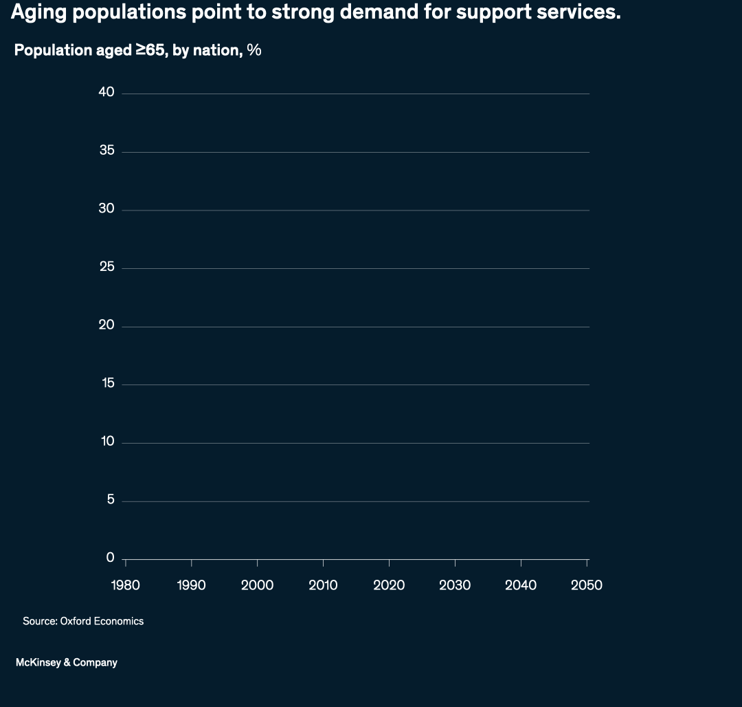
Image description.
A line graph shows the percentage of the population aged 65 and older for various countries from 1980 to 2050. The graph displays a general upward trend across all countries, with some experiencing more rapid growth than others. South Korea is projected to have the highest percentage of older adults by 2050, rising sharply from around 5% in 2000 to nearly 40%. Japan and Italy also show significant increases, reaching around 35% and 33%, respectively. Other countries, such as Singapore, China, Germany, and France, are expected to have between 20% and 30% of their populations aged 65 and older by 2050. The graph also includes data for countries with lower percentages of older adults, such as the US, Australia, Brazil, Saudi Arabia, South Africa, Egypt, Nigeria, and the UAE, which are expected to remain below 20% by 2050. The data is sourced from Oxford Economics.
This image description was completed with the assistance of Writer, a gen AI tool.
Source: Oxford Economics
End of image description.
Shifting population dynamics are also reshaping the global workforce. Different regions are expected to see peaks in working-age populations at different times, which can be visualized as three waves. The first wave, which includes the United States, is nearing its end. Demographic shifts in the United States are contributing to workforce shortages at a time when the country is already falling short on labor productivity in sectors such as construction, healthcare, and small businesses.
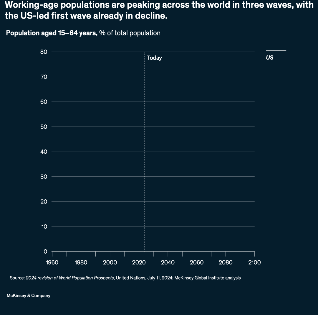
Image description.
A line chart illustrates the percentage of the total population aged 15-64 years across different regions from 1960 to 2100. The chart features four distinct lines, each representing a specific region or group of regions: the US (white), the 1st wave (dark blue), comprising advanced Asia, Central and Eastern Europe, Greater China, North America, and Western Europe; the 2nd wave (light blue), including emerging Asia, India, Latin America and Caribbean, and Middle East and North Africa; and the 3rd wave (teal), representing sub-Saharan Africa. The US line peaks around 1980 at approximately 66% before declining to around 60% by 2100. The 1st wave peaks slightly later, around 2000, at roughly 70%, then decreases to about 55% by 2100. The 2nd wave reaches its peak around 2020 at approximately 67%, followed by a decline to around 55% by 2100. In contrast, the 3rd wave, representing sub-Saharan Africa, shows a steady increase from around 52% in 1960 to a peak of about 68% around 2065, before gradually declining. A vertical dotted line marks the year 2020, indicating the current time point on the chart.
This image description was completed with the assistance of Writer, a gen AI tool.
Source: 2024 revision of World Population Prospects, United Nations, July 11, 2024; McKinsey Global Institute analysis
While the first wave of demographic shifts has already left the United States lagging behind in healthcare labor productivity—as well as in other sectors—it is not alone in facing workforce challenges. Worldwide, the healthcare worker shortage is projected to reach at least ten million by 2030. Closing the workforce gap in this sector could yield significant benefits, potentially eliminating 7 percent of the disease burden and adding $1.1 trillion to the global economy.
Besides planning for demographic shifts to address workforce challenges, stakeholders should also prioritize employee health and well-being. McKinsey analyzed a “Well-being 100” portfolio comprising 100 companies with the highest scores for employee well-being on the job-seeking website Indeed. This portfolio outperformed major market indexes, including the S&P 500, Nasdaq composite, and Russell 3000, between 2021 and 2024.
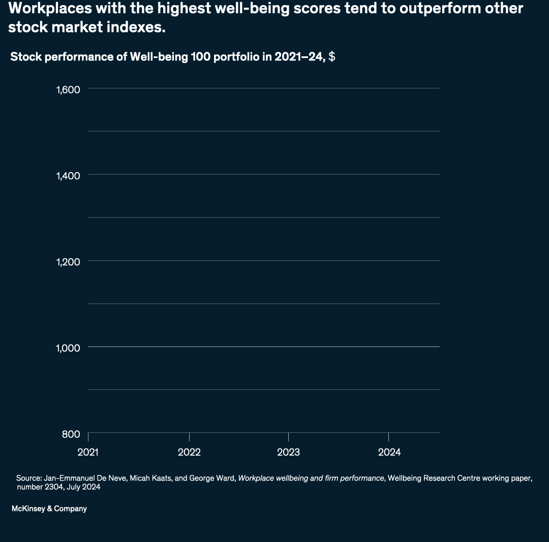
Image description.
A line chart illustrates the stock performance of the Well-being 100 portfolio from 2021 to 2024, comparing it to other major stock market indexes. The chart displays four distinct lines, each representing a different index: the Well-being 100 (white), S&P 500 (light blue), Nasdaq composite (blue), and Russell 3000 (purple). The y-axis measures stock performance in dollars, ranging from 800 to 1,600, while the x-axis spans the years 2021 to 2024. The Well-being 100 consistently outperforms the other indexes throughout the period, with a notable peak in 2024. The S&P 500, Nasdaq composite, and Russell 3000 follow similar trends, with the Well-being 100 maintaining a significant lead. By 2024, the Well-being 100 reaches a value of approximately 1,600, while the S&P 500 is around 1,400, the Nasdaq composite is slightly below 1,400, and the Russell 3000 is around 1,350.
This image description was completed with the assistance of Writer, a gen AI tool.
Source: Jan-Emmanuel De Neve, Micah Kaats, and George Ward, Workplace wellbeing and firm performance, Wellbeing Research Centre working paper, number 2304, July 2024
End of image description.
Resilience in a fragmented world
Trade relationships are in flux as nations adapt to geopolitical tension and technological change. Across sectors, companies and organizations have sought to balance efficiency with security, marking a renewed focus on resilience and strategic interdependence.
Few topics have been as top of mind globally this year as trade and tariffs. The “rearrangement ratio,” introduced by McKinsey, measures the difficulty of shifting US imports from China to alternative suppliers. This chart shows the relative difficulties that different sectors faced in the wake of US tariffs announced early in the year. Basic manufacturing sectors faced the greatest challenges, with ratios exceeding 0.9 (on a 0.0 to 1.0 scale), while pharmaceuticals had the lowest at 0.03. This metric highlights the complexities of reducing trade dependencies. Some products, such as consumer electronics, are significantly harder to rearrange than others.
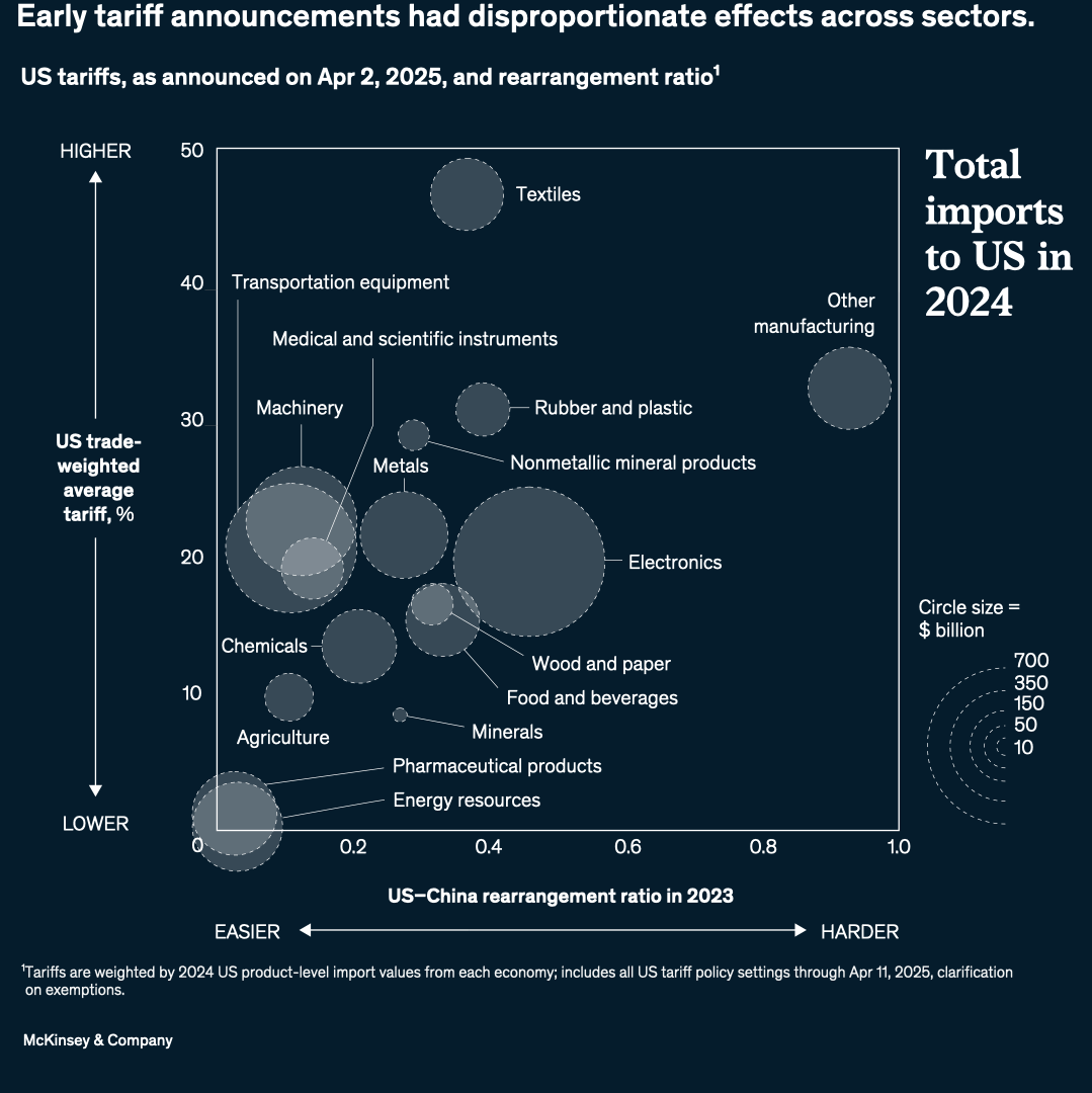
Image description.
A scatterplot bubble chart illustrates the relationship between US tariffs and the US-China rearrangement ratio across various sectors. The chart's x-axis represents the US-China rearrangement ratio in 2023, ranging from "EASIER" (0.2) to "HARDER" (1.0), while the y-axis shows the US trade-weighted average tariff percentage, spanning from "LOWER" (0%) to "HIGHER" (50%). Each bubble corresponds to a specific sector, with its size indicating the total imports to the US from China in 2024, measured in billions of dollars. The chart reveals that sectors like textiles, transportation equipment, and medical and scientific instruments have higher tariffs, above 30%, and relatively lower rearrangement ratios, below 0.4. In contrast, sectors such as pharmaceutical products and energy resources have lower tariffs, below 10%, and varying rearrangement ratios. The size of the bubbles varies significantly, with electronics being one of the largest, representing substantial imports. Overall, the chart provides a visual representation of how different sectors are affected by US tariffs and their rearrangement ratios with China.
This image description was completed with the assistance of Writer, a gen AI tool.
Source: McKInsey and Company
End of image description.
To mitigate vulnerabilities associated with geographic concentration, economies must consider diversifying their supply chains. For example, as leading-edge semiconductor production expands beyond Taiwan and South Korea, increased foreign direct investment could bolster the United States’ capacity, potentially making it the second-largest producer by the early 2030s. However, the reliance on global supply chains for raw materials and manufacturing equipment remains a critical factor in the industry’s future stability.
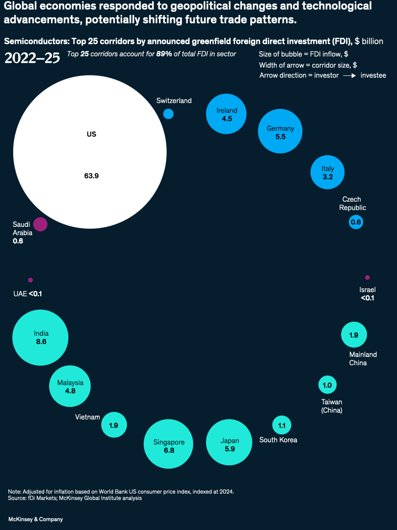
Image description.
A bubble and arrow diagram illustrates the top 25 corridors by announced greenfield foreign direct investment (FDI) in the semiconductor sector from 2022 to 2025. The diagram is a network chart with circles representing countries and arrows indicating the direction of investment between them. The size of each circle corresponds to the amount of FDI inflow, while the width of the arrows represents the corridor size. The US is the largest circle, with $63.9 billion in FDI, primarily from South Korea and Taiwan, China. Other significant recipients include India ($8.6 billion), Singapore ($6.8 billion), Japan ($5.9 billion), Ireland ($4.5 billion), Malaysia ($4.8 billion), Germany ($5.5 billion), and Italy ($3.2 billion). The diagram also highlights that Taiwan, China was the source of more than 50% of all announced investment by value, while Europe was the destination for less than 15% of all announced investment. Additionally, India and Southeast Asia received increasing announced investment, targeting non-leading-edge nodes. The data is adjusted for inflation based on the World Bank US consumer price index, indexed at 2024, and sourced from fDi Markets and McKinsey Global Institute analysis.
This image description was completed with the assistance of Writer, a gen AI tool.
Source: fDi Markets; McKinsey Global Institute analysis
End of image description.