At a glance
- The global balance sheet takes stock of all assets, liabilities, and wealth, providing a lens into economic health. This annual update estimates that it reached nearly $1.8 quadrillion ($1,800 trillion) in 2025, up from $1.7 quadrillion in 2024. Several asset classes grew further out of balance with the underlying economy, raising the possibility of corrections through inflation, asset valuation losses, or, optimally, productivity growth.
- The balance sheet’s mounting detachment from the global economy was driven by the world’s two biggest economies in 2025. US equity values soared to 2.4 times corporate net assets as profits were double their share of GDP since 2000. China’s corporate debt grew to 80 percent of real assets, versus 50 percent globally. Government debt remains near all-time highs in the United States and has grown most rapidly in China.
- Globally, most corporate and household debt and real estate moved closer to 25-year averages relative to GDP. Inflation helped with this normalization, although values remain well above pre-2000 levels. The ratio of productive assets to GDP held steady amid flat investment.
- Global household wealth growth rose to a new high of $570 trillion, driven by “paper” gains. Only 20 percent came from real capital formation, while valuations of existing assets grew four percentage points faster than already-high consumer price inflation. In the United States and Canada, equity values drove wealth growth. China, France, and Germany saw a drop in paper wealth as real estate prices declined. In the United Kingdom and Japan, inflation pushed up asset values.
- Major economies were on different pathways entering 2026. The United States has been in a “productivity acceleration” scenario, but high public debt and equities add the possibility of “sustained inflation” or “balance sheet reset.” Europe has gravitated toward “secular stagnation” as sluggish demand depresses growth and interest rates. China has experienced a partial balance sheet reset amid declining property values, although government spending and corporate investment have continued to propel balance sheet growth.
In this report, we provide an update on the global balance sheet in 2025, exploring to what extent its recent expansion, and by extension wealth growth, has been “in balance.” The analysis finds that wealth was, to an even greater extent than previously, rooted in asset values rising faster than real economy investment and growth, creating record levels of global wealth “on paper.”
Although many economies that were studied experienced wealth and balance sheet swings, the global picture was largely driven by its two biggest: the United States and China. Higher US equity values and the accumulation of China’s public and private debt brought some near-term economic benefits but left their economies more vulnerable to potential corrections.
Businesses use both income statements and balance sheets to develop a complete picture of their financial health. Analysts of the global economy tend to focus on the former. Since 2021, MGI has developed a “global balance sheet” to fill this gap, representing a clearer view into the world economy’s wealth and health.
Our previous reports found that from the mid-1990s to the COVID-19 pandemic, household wealth expanded faster than gross domestic product. Asset prices for real estate, equities, and bonds grew, as did debt and deposits. This occurred amid declining (and eventually rock-bottom) interest rates, rapidly expanding US profits, and a property boom in China. Productivity did not keep pace across advanced economies, nor did real wealth formation through net new investment.
When the balance sheet outruns the underlying economy, weaknesses can be exposed. When real estate and equity values rise faster than GDP, capital may disproportionately go to asset repurchases, sometimes with a lot of leverage. This may push up valuations but leave the economy deprived of the type of investment that generates long-run growth. For households, wealth rises but merely on paper, with heightened risks of eventual corrections. Growing asset values also tend to exacerbate wealth inequality, as existing owners of wealth see large gains while entering asset markets becomes harder for others (for example, young households trying to buy a home).
Elevated balance sheets may correct in one of three ways. A productivity acceleration scenario involves higher income supporting high asset values and debt; this is the most preferred outcome. A sustained inflation scenario brings down the real values of assets and debt, recalibrating the balance sheet with higher nominal GDP. But it can erode inflation-adjusted wealth along with other undesirable side effects. A balance sheet reset scenario, entailing a drop in asset values, deleveraging, and defaults, would shrink the balance sheet in absolute terms, with severe wealth losses and, often, lengthy periods of lost economic growth. Or the balance sheet may just stay high, particularly under secular-stagnation-like conditions of low investment and interest rates, as seen in the United States and Europe in the 2010s. That’s seemingly good for wealth, but at the cost of low growth and rising leverage.
Historically, most balance sheet corrections have taken place through higher inflation. Indeed, the inflation coming out of the COVID-19 pandemic in the United States and Europe brought a correction in the balance sheet (and wealth) ratio to GDP. In China, a drop in property values drove a decline in wealth to GDP.
In 2025, global wealth reached a higher dollar value than ever before. But how “healthy” was this new growth? After postpandemic corrections, some balance sheet items have resumed expansion and reached new heights. This was particularly the case for US equity as AI fueled market optimism and corporate earnings continued to climb. Rising government debt relative to GDP remains a challenge in many economies amid higher interest rates. Stocks of currency and deposits remain high compared to longer-term historical norms. Altogether, this has culminated in even more wealth on paper than in the past several decades and raises the stakes for US corporate earnings to deliver.
Balance sheets, and macroeconomic factors like productivity and inflation, point to diverging trends across major economies. Recognizing the swing factors that can shift an economy to productivity acceleration is more urgent than ever: for the United States, corporate earnings and greater government saving (in other words, less borrowing); for Europe, greater investment; for China, higher domestic consumption.
Future global wealth and stability may depend on it.
The global balance sheet: Latest totals
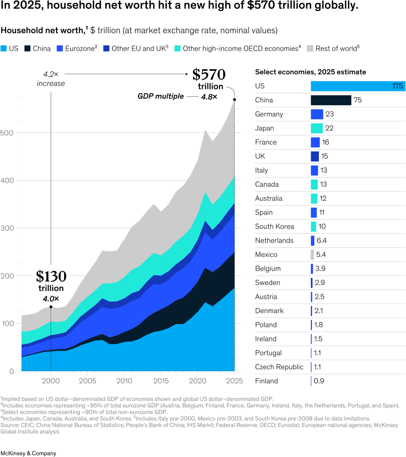
In 2025, MGI’s estimates show, the global balance sheet reached nearly $1.8 quadrillion in total assets, up from $1.7 quadrillion a year earlier.1 This includes $570 trillion of household wealth. In each case, this was the highest ever.
Building from the bottom up, real assets include the real estate, infrastructure, machinery and equipment, and intellectual property held across households, governments, and corporations. These totaled $620 trillion, constituting global net worth across sectors.
Financial assets held outside the financial sector include equity, bonds, loans, currency and deposits, and pensions, among other assets. Every financial asset has a corresponding liability, netting out at the global level.1 This “financial layer” serves to separate wealth from asset ownership, and it was close to the total value of real assets.
The financial sector, in turn, intermediates these financial assets and liabilities. At $550 trillion, it has reached 90 percent of the value of real assets.
Wealth is ultimately the balancing item on balance sheets, equaling total assets less liabilities. It was $600 trillion in 2025.
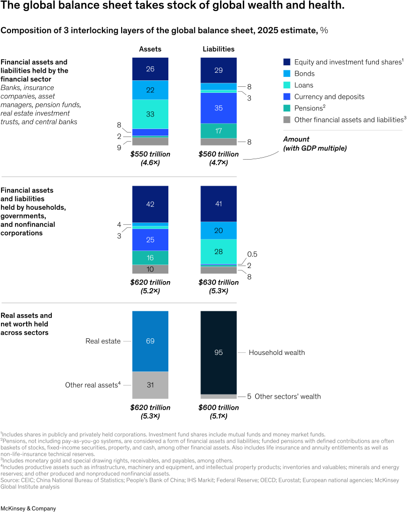
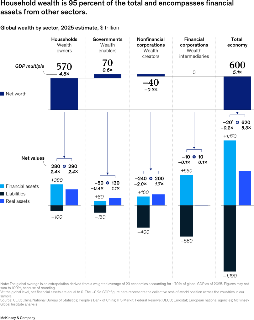
Each major economic sector has its own balance sheet. They play different roles in the economy and, as a result, have different compositions. Both nonfinancial and financial corporations tend to have very little wealth, because corporate equity is considered a liability to owners of the shares. However, their asset compositions are quite different, with real assets (for example, machinery) playing a significant role for nonfinancial corporations. Governments tend to have some wealth, unless their debt liabilities exceed all assets.
Total wealth across all sectors was $600 trillion in 2025, with 95 percent owned by households. About half of household wealth is in real assets, mostly property. The other half is financial assets, notably governments through their bonds, nonfinancial corporations via equities, and financial corporations through things like investment fund shares and pension assets.
In this report, we focus on household rather than total wealth because it has immediate economic relevance for spending and saving decisions.
The interconnectedness of the balance sheet means that stress in other sectors may ultimately affect household wealth. It is thus important to understand the full balance sheet to gauge how household wealth might evolve.
As of 2025, global household wealth totaled a record $570 trillion, up $40 trillion from 2024. That was more than quadruple its value in 2000, at nominal values and market exchange rates. This wealth grew faster than GDP, posing questions about its health and stability (see sidebar “When is wealth growth ‘healthy’?”).
The United States continues to hold the largest share, at 30 percent. The eurozone and China held the next-largest shares, at 14 and 13 percent, respectively.1
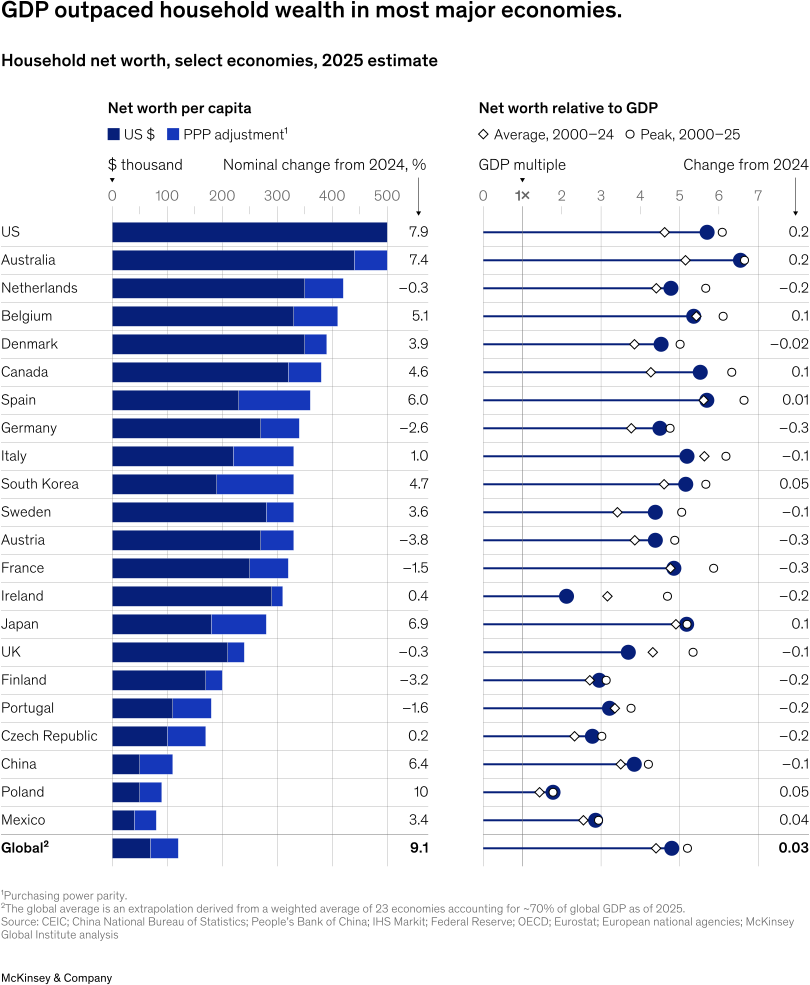
At the country level, Poland, Ireland, Spain, and Sweden experienced the highest rates of household wealth growth (in dollar terms), each reaching double digits. Eurozone countries including Austria, France, Germany, Italy, and Portugal saw wealth grow slightly in dollar terms but decline in constant foreign-exchange terms as the dollar fell against the euro from 2024 to 2025.
Household wealth per capita grew in most countries. However, it did not keep pace with GDP. This resulted largely from slowing real estate values, correcting from pandemic peaks. In many economies, real estate is the largest component of household wealth.
There were multiple exceptions. In the United States and Australia, which have the highest wealth per capita, household wealth expanded by at least 20 percentage points of GDP.1 In the United States, this was largely equity driven. In Japan, household wealth as a share of GDP grew by double-digit percentage points. This was more a story of inflation growing and assets keeping pace.
Multiple eurozone countries experienced a decline in per capita wealth in purchasing power parity terms.2 This was in large part attributable to declining real estate values.
Is the balance sheet ‘in balance’?
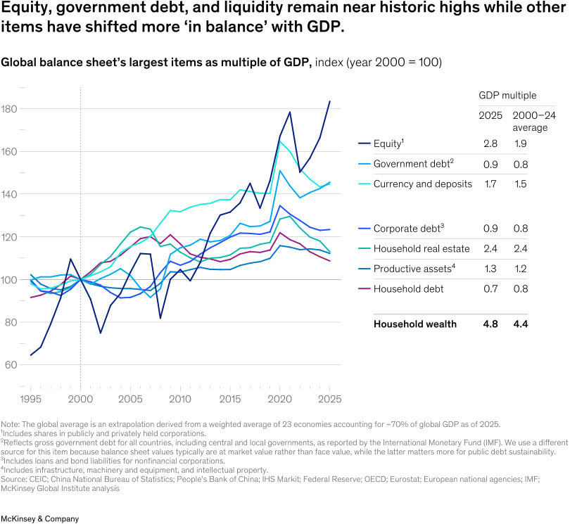
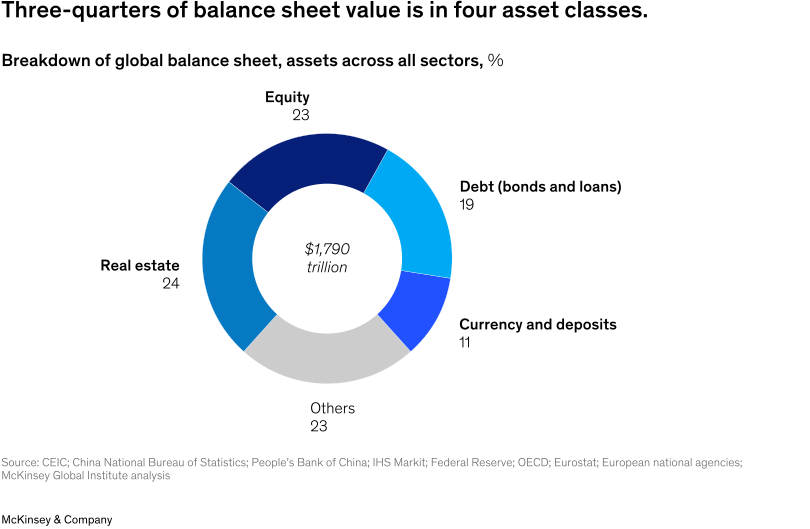
The global balance sheet is a compilation of separate asset classes, which often grow in different ways across countries. More than three-quarters of its value is in real estate, equity, debt, and currency and deposits.
Assessing balance sheet health requires a deep dive into each asset class, to understand how they move over time relative to the underlying economy. We walk through them in this chapter, with a focus on how economies evolved in 2025.
In summary, we find the following:
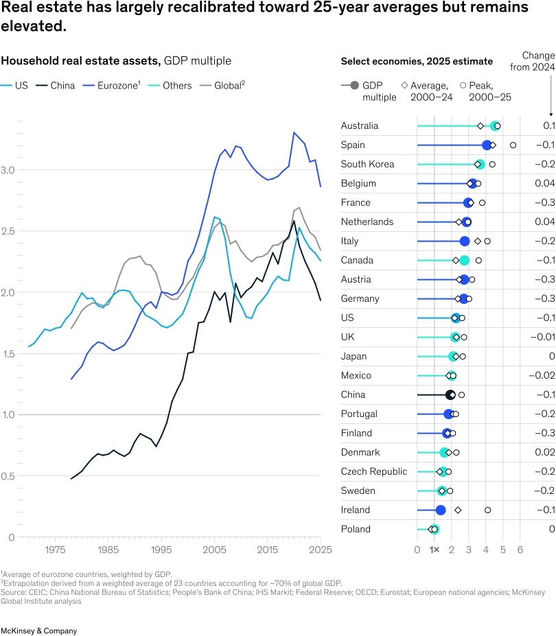
- Real estate declined relative to GDP across most economies. Australia was a major exception, and it topped the list of real estate values, at 4.5 times GDP.
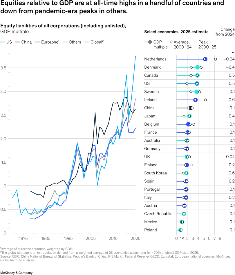
- Equity largely grew. Relative to GDP, it climbed the most in South Korea, the United States, Canada, and Japan. Of these countries, equity was highest in Canada and the United States, at 3.8 and 3.7 times GDP, respectively.
- Corporate debt increased the most in China. Chinese corporate debt reached 1.7 times GDP, the highest among our economies of focus.
- Government debt continued to expand. It exceeded 100 percent of GDP in a number of countries, with Japan, Italy, and the United States topping the list (although in Japan, inflation brought this ratio down).
- Currency and deposits reached new all-time highs in China and South Korea. Japan still tops the list but also experienced the largest drop amid higher inflation.
When could government debt become unsustainable?
There is no universally agreed-upon threshold, or band, at which government debt becomes unsustainable, especially for high-income economies issuing debt in their own currencies.
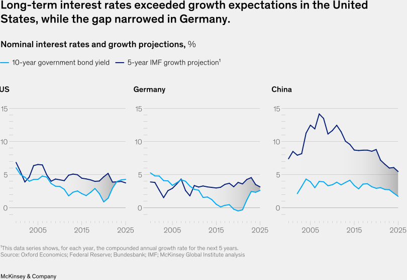
Understanding the trajectory of public debt involves three central variables: (1) the level of primary (noninterest) deficits as a share of GDP; (2) nominal GDP growth (g); and (3) the rate on long-term government bonds (r).1 When growth exceeds interest rates, there is some fiscal space to run primary deficits without growing the public-debt-to-GDP ratio, since the cost the government is paying to borrow money is less than the growth of the economy. The larger the gap between g and r, the greater space for deficits without growing the debt-to-GDP ratio.2 In the United States, the ratio of public debt to GDP remained relatively stable in the 2010s even though the government was running persistent deficits, because interest rates were much lower than nominal GDP growth rates.3
Given the new environment with notable increases in interest rates in the United States and Europe, and decreases in growth projections in China, the gap between g and r is much closer to zero than it was in the past decade and a half. Some projections even suggest that in the United States, the signs actually flipped in 2025, with interest rates exceededing expected growth rates.4
There are multiple reasons to believe that interest rates are structurally higher today than in the prepandemic period. These include higher planned investments, lower planned saving, and higher risk (for example, from shifting geopolitics and rising public debt).5 As a result, fiscal budgets could come under pressure and the debt-to-GDP ratio is poised to further increase, unless major steps are taken to reduce government borrowing.
At the end of the chapter, we examine other features of balance sheet health, including productive asset formation and cross-border imbalances.
Real estate
Real estate is the largest single asset on the global balance sheet and, in most economies, the biggest component of household wealth. Globally, two-thirds is held by households.
In most economies, household real estate relative to GDP peaked during the pandemic. Since then, values have recalibrated toward long-term averages. In both the eurozone and China, real estate relative to GDP is back down to levels seen two decades ago. Across major economies, real estate values are still higher than what was typical relative to income in the last decades of the 20th century.1
In 2025, nearly all economies of focus saw real estate values continue to correct relative to GDP. One exception was Australia, where household real estate grew by more than 10 percentage points of GDP. It also remained the most elevated relative to GDP (by 80 percentage points) compared to its average of the past 25 years.
Equity
The second-largest component of the balance sheet is equity, which is a liability for an issuing corporation and held as an asset by households, governments, and financial corporations. The ratio of equity to GDP can be interpreted as a variation of a P/E ratio for an economy; elevated ratios by historical standards indicate high expectations for future growth, while also implying the possibility of correction if growth disappoints.
In 2025, countries generally fell into two groups. Some, including the United States, Canada, Japan, and South Korea, reached all-time highs in equity. In the United States, values were nearly double the historical average. Some of this reflected a boom in tech, particularly AI. Looking across the S&P 500, just over 50 percent of the growth in market capitalization from 2021 through 2025 came from the “Magnificent Seven” firms commonly associated with AI.1 Another driving force was the expansion in the profit share of GDP, which we turn to later in the chapter.
Others peaked around the time of the pandemic, including most European economies and China, although they saw some growth in 2025.2
Equity (continued)
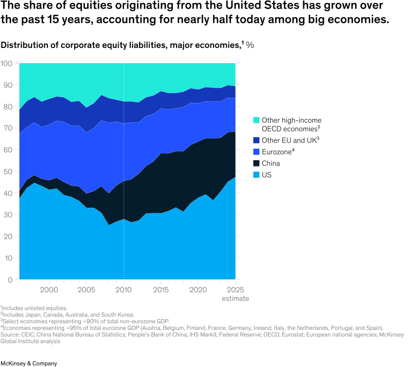
Equity originating from US firms holds particular significance for global wealth. The United States accounts for nearly half of the equity across countries in our global sample. This is much higher than in the past, following rapid equity-price appreciation.
The impact of US equity markets extends beyond American households. More than one-third of US equity liabilities are owed to foreign entities. International investment positions are significantly composed of equity, with the United States on balance owing more to the rest of the world, and many other countries on balance owning more equity originating from abroad, suggesting that many cross-border equity liabilities originate from the United States.
Equity (continued)
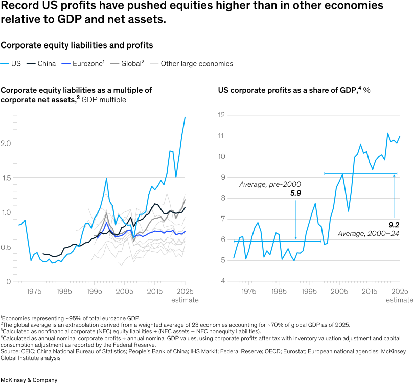
While the United States is one of several countries with high equity-to-GDP ratios, it stands out for its high equity-to-net-asset ratios. US equity values rose to 2.4 times net assets, while the figure in most other countries hovered around 1.0.
Economic theory suggests that the equity-to-net-asset value, also called “Tobin’s Q,” should be around one in the long term: Equity should converge to net assets, or the reinvestment value, if there is perfect competition.1
In the United States, returns on invested capital rose and the corporate profit share of GDP doubled relative to pre-2000 averages. Fundamentally, high US equity valuations depend on corporate earnings continuing to outgrow GDP in the long run.
Debt
The next-largest component of the balance sheet is debt, representing both loans and bonds. Its dynamics vary substantially by sector and across countries.
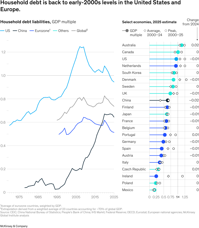
Household debt relative to GDP is trending down in most economies. Many are below their average levels since 2000; Ireland in particular stands out for being more than 40 percentage points of GDP below its average since then. On the high end, household debt in Australia and Canada remains north of 100 percent of GDP, although still below its peak. China’s figure is the most elevated compared to its post-2000 average.
Lower debt means healthier balance sheets for households. But higher debt in other sectors could mean an eventual correction that affects household wealth through ownership of financial assets or participation in pension funds holding those assets.
Debt (continued)
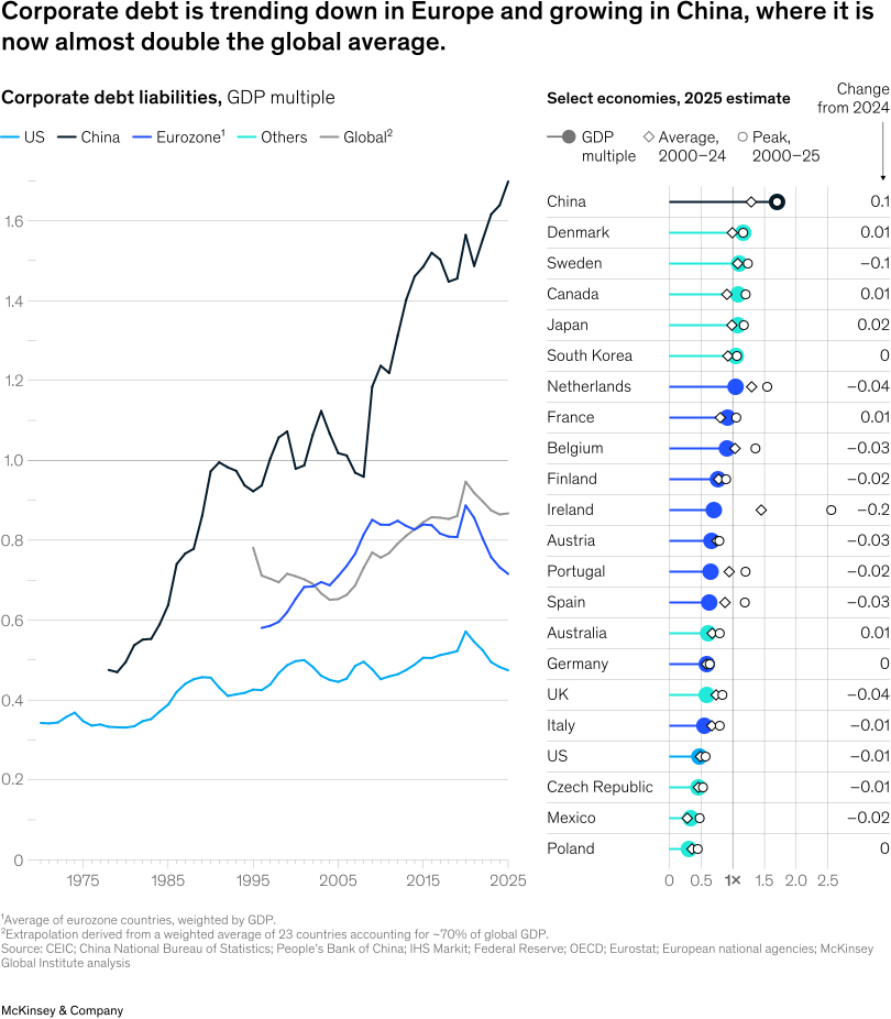
Corporate debt levels are below or in line with 25-year averages in much of the world. In 2025, Ireland stood out for a reduction in corporate debt relative to GDP of 21 percentage points.
China is a major exception. Its corporate debt is double the global average and grew by six percentage points of GDP in 2025. This comes amid a growing rate of loss-making firms and deflating producer prices.1 China’s corporate debt is also highest relative to corporate real assets, with a ratio of about 80 percent. The typical range across countries is 40 to 50 percent.
Debt (continued)
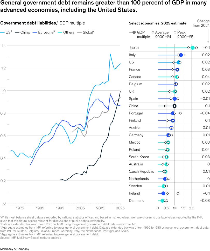
Government debt, by contrast, remains a pressing challenge for many countries.
As of 2025, it was over 100 percent of GDP in Japan, Italy, the United States, France, Canada, Belgium, the United Kingdom, and Spain. China had the fastest growth in government debt-to-GDP ratios, by nine percentage points, continuing a sharp uptick in recent years.1 While Japan’s level remained the highest relative to GDP, it has seen the greatest drop, eight percentage points, amid a significant increase in inflation.
As interest rates remain elevated across advanced economies, reaching or exceeding expected economic growth rates, government debt sustainability is increasingly in the spotlight. Economies may not simply be able to grow their way out of debt (see sidebar “When could government debt become unsustainable?”).
Currency and deposits
Monetary aggregates, shown here as currency and deposits, are another balance sheet signal of economic health. They are assets for households, governments, and nonfinancial corporations, and liabilities for financial corporations (including central banks).
Currency and deposits expand as a result of loans provided by depository banks or via central bank creation of base money, which includes programs such as quantitative easing.1 Quantitative tightening, or central bank action to reduce its balance sheet size, thus dampens the growth of currency and deposits.
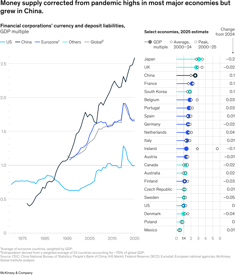
In recent years, inflation and quantitative tightening have brought down currency and deposits relative to GDP from pandemic-era peaks in the United States, most European economies, and Japan. Still, they remain elevated compared to levels before the global financial crisis.
As of 2025, Japan, the United Kingdom, China, and France have currency and deposit levels more than double GDP. China saw the most significant growth, ten percentage points of GDP, over the past year. This is concurrent with high lending by Chinese banks, particularly to corporations.
Productive assets
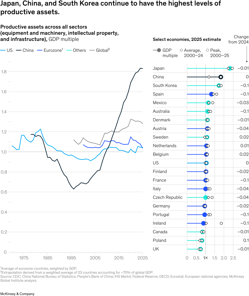
Another component of balance sheet health is productive assets, a smaller set of real assets encompassing infrastructure, machinery and equipment, and intellectual property.1 These lay the foundation for future output and are typically held on balance sheets of nonfinancial corporations and governments.
These assets tend to move closely in tandem with GDP, with the causation going both ways: Higher investment drives productivity and growth; and growth gives firms (and governments) the financial means and revenue opportunities to invest. There can be reasons for them to move out of sync, for example a sudden industrial buildup that results in faster productivity growth. One recent example is AI data centers and related infrastructure. That said, deviations often signal under- or overinvestment.
As of 2025, Japan, China, and South Korea continued to top the list in terms of productive capital-to-output ratios, due both to a high share of capital-intensive production and overcapacity. The United Kingdom, Canada, and Poland have the lowest stocks, although Poland grew the most of any country in our sample.
Given the overall stability of productive asset stocks relative to GDP, it is not always easy to get a sense of the nearer-term direction of flows, or changes in stocks.2 Looking at these directly, 2025 net investment rates exceeded long-term averages in multiple countries, including Poland, Sweden, the United States, Italy, and Spain.
A range of countries, notably China, South Korea, and Ireland, experienced a sharp drop compared to average rates. Germany, Ireland, and Australia saw negative net investment, meaning capital expenditures were below replacement requirements, asset values declined, or both.
Cross-border positions
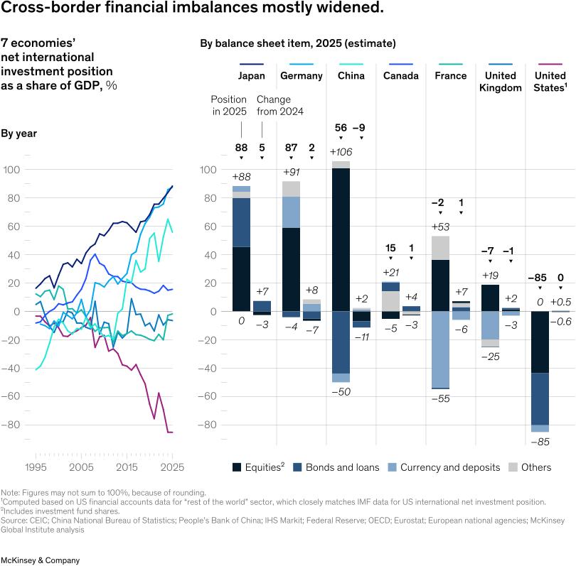
A final component of balance sheet health is cross-border positions. Within a given financial asset class, an economy may have a positive or negative balance, signaling net inflows or outflows over time. When they accumulate for an extended period in positive or negative directions, they may signal risks.1
In macroeconomic accounting, net inflows or outflows of financial assets equal domestic savings minus domestic investment. These flows can significantly influence national wealth. Domestic savings greater than investment means a net lending position to the rest of the world. Investment that exceeds savings means a net borrowing position.2
International positions are shaped by these domestic imbalances as well as by differences in asset valuations. These imbalances have increasingly come under scrutiny, meaning net lending and borrowing as a driver of wealth may face political limits as occurred, for example, during the eurozone debt crisis.
Net flows of financial assets accumulate to international investment positions, which have grown substantially since 2010. In 2025, they reached new heights in Japan and Germany, both nearly 90 percent of GDP in a net lending position, and in the United States, nearly 90 percent of GDP in a net borrowing position. Half of the US negative position is in equity, as US equities have grown in value more than those of other economies. Major European economies, Japan, and Canada have positive balances in equity, meaning on net, they own more equity issued abroad.
Has wealth growth been ‘healthy’?
In 2025, household wealth growth accelerated to 7.3 percent from the 5.9 percent annual average since 2000. In this chapter, we explore the drivers of household wealth growth and the extent to which they have been what we consider healthy.
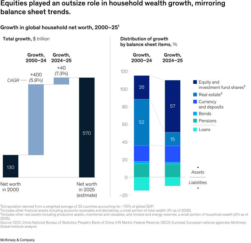
Real estate accounts for about half of global household wealth. About a quarter is held in equity and investment funds, 20 percent in currency and deposits, and 20 percent in bonds and pensions. (Loans were equal to 15 percent, in the negative direction.)
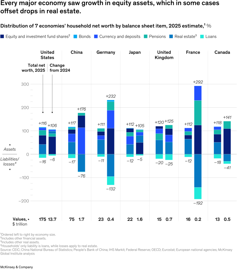
Household wealth composition in major economies varies, in part reflecting different retirement systems. Notably, in the United States and Canada, equity plays a large role, making up more than one-third of household wealth. In China and Japan, currency and deposits make up more than one-third.
In 2025, equity was the single largest catalyst for wealth creation in nearly all major economies. In many, including China, Germany, France, Italy, and Canada, real estate declined.
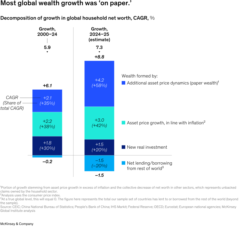
In 2025, global wealth growth was driven to a greater extent by paper wealth, or nominal asset value growth decoupled from the real economy.
Only 20 percent of household wealth growth was based on net new investment (real assets including machinery and equipment, homes and buildings, infrastructure, and intellectual property, less depreciation), compared to 30 percent on average from 2000 to 2024. Nearly 60 percent came from asset price growth above and beyond general inflation and negative net worth positions from other sectors.1 This was a marked increase over the average from 2000 to 2024, when paper gains drove one-third of global wealth growth.
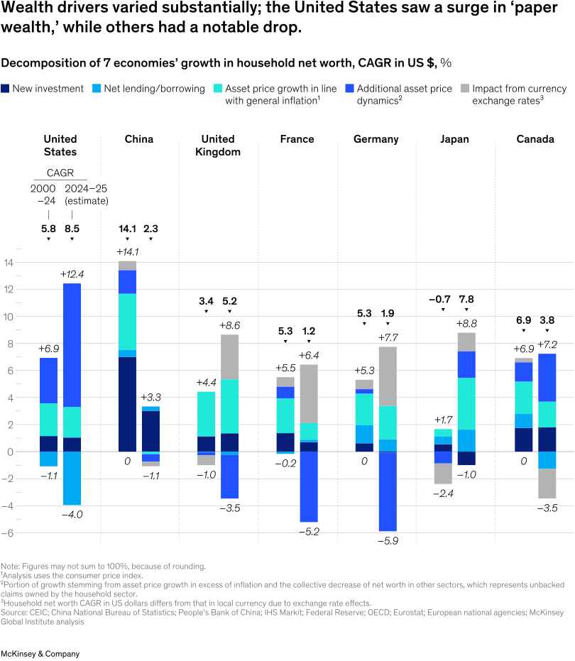
Dynamics of investment and asset-price-driven wealth growth varied substantially across countries.
China saw the largest drop in wealth growth as net investment rates declined, inflation hovered around zero, and asset values, particularly in property, continued their multiyear decline.
Japan saw the largest upswing, driven mostly by valuation gains, a significant pivot following decades of near-zero inflation.
The United States also saw an increase, due largely to valuation gains.
France and Germany both experienced declines in net new investment and valuations—and, when removing positive foreign exchange effects, wealth losses.
The United Kingdom and Canada saw slight declines in wealth growth in local currency terms. In Canada, domestic equity markets appear to have lifted paper wealth while also slightly rebalancing the positive international financial position.
What this means for executives
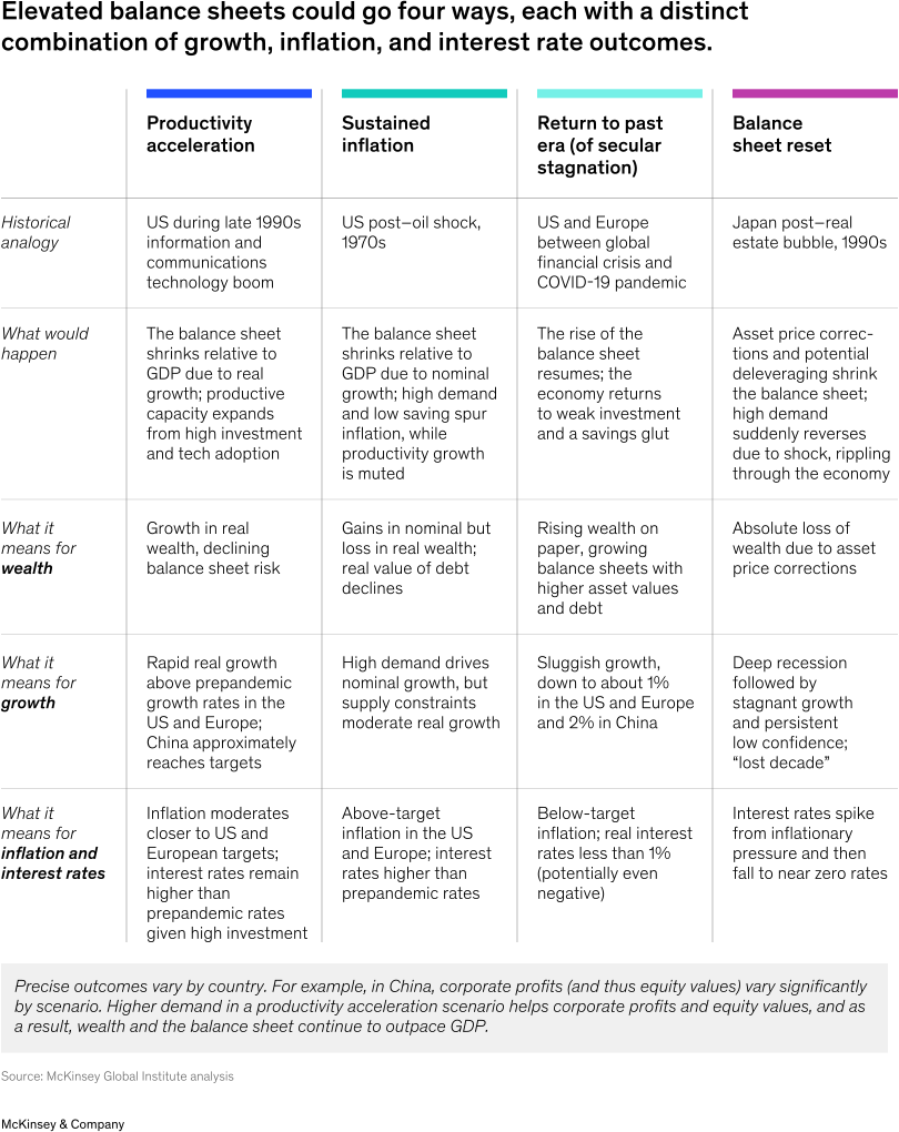
A balance sheet that is out of kilter with the economy—in other words, with high paper wealth fueled by debt and liquidity levels significantly above historical norms—can unwind via higher productivity, higher inflation, or asset price corrections. Balance sheets may also remain large, typically under secular-stagnation-like conditions, effectively kicking the can down the road for potential correction.
Each of these four scenarios shapes the long-term economic outlook. Only productivity acceleration delivers real economic growth justifying valuations, thus protecting wealth. The others sacrifice wealth, growth, or both. Sustained inflation reduces real values of wealth, secular stagnation sees low growth, and a balance sheet reset signals a loss of wealth and growth. Importantly for business leaders, two scenarios would likely mean structurally higher interest rates: Productivity acceleration would entail greater demand for capital amid higher business investment, while sustained inflation would likely involve central banks tightening policy rates and, ultimately, higher long-term yields.
All scenarios are possible for all major economies. However, they appear to be on different pathways, with different swing factors that could move them from one trajectory to another.
For executives, this means both preparing for an unusually broad array of economic pathways and carefully watching the swing factors, which rise above the noise of daily indicators (see sidebar “Business planning for all scenarios”). Leaders across sectors and industries could also explore ways to encourage the optimal outcome, the productivity acceleration scenario.
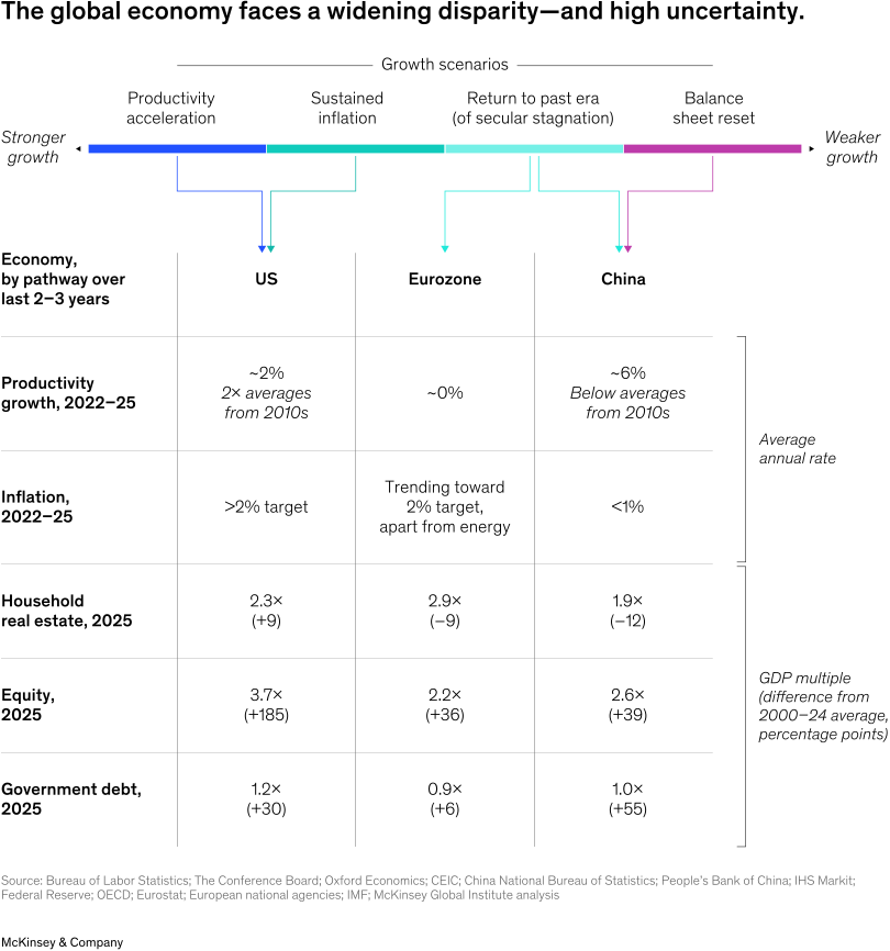
Major economies show significant divergence in trends across macro drivers of productivity, inflation, and interest rates, along with fundamental balance sheet components including real estate, equity, and debt.
The United States has seen a structural uptick in both productivity growth and interest rates relative to the prepandemic period. Productive investment, particularly driven by the tech sector, has recently grown. High equity values also signal market confidence, although they may pose some downside risks. Meanwhile, inflation remains above the Federal Reserve’s 2 percent target and government debt remains near all-time highs, adding further inflation risk.
The eurozone has experienced a return to secular-stagnation-like conditions, akin to the prepandemic period, amid flat productivity and higher saving. Europe’s balance sheets overall appear more in balance compared to the US balance sheet (with a few exceptions, such as Italy’s government debt). Productivity growth rates, however, are down across the region’s three largest economies (Germany, France, and Italy). Until recently, inflation was mostly trending toward the European Central Bank’s 2 percent target, although Europe is more exposed to energy price changes.2 Personal savings rates remain high amid a drop in aggregate demand and per capita household wealth has declined in PPP terms in Germany and France.3 Productive investment remains below prepandemic and global averages.
China continues to work through a partial balance sheet reset in the face of a continued decline in real estate, with questions about future growth drivers amid low household demand and a boom in corporate investment. Productivity growth has receded in recent years, although it remains above the rate in advanced economies.4 Inflation and, in tandem, nominal interest rates have dropped, and concerns have shifted to dealing with deflation risks.5 At a macro level, lower household property investment has been offset by higher corporate investment, especially among state-owned enterprises, and by government spending.6 This has coincided with a substantial rise in corporate and government debt, both reaching all-time highs.
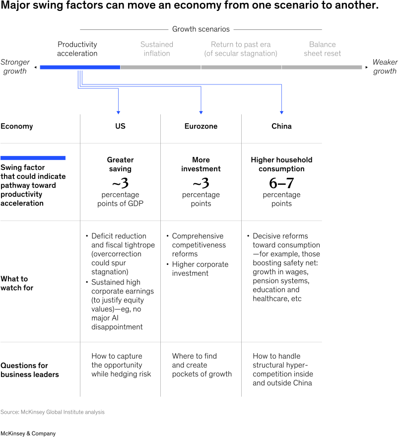
While the United States is the only major economy showing signs of productivity acceleration, it is not guaranteed long term, and other economies have a potential path to it. Focusing on “swing factors” could help filter signal from noise in the daily flow of indicators, market fluctuations, and political headlines. These factors differ by economy.
In the United States, swing factors that could knock the economy out of productivity acceleration include the “fiscal tightrope” and corporate earnings.
- Government debt stands at about 120 percent of GDP. Combined with higher interest rates, this means more public spending will need to be directed toward debt repayment. Public spending could come under pressure, especially from bond investors, in the form of higher market interest rates. These translate into higher business costs of capital. If fiscal policy tightens too little, a public debt crisis or sustained inflation becomes more likely.7 Too much, and secular stagnation is a potential outcome.8 To bring budgets back into balance, greater fiscal saving (or lower borrowing) on the order of three percentage points of GDP would be needed.9
- On the corporate-earnings side, an equity or wealth reset could be triggered by a large structural shift in the longer-term outlook—for example, from AI disappointment or large geopolitical disruption. Equities are at all-time highs, at 3.7 times GDP and 2.4 times net assets, and constitute nearly 40 percent of household wealth.10 A price correction could result in a sharp pullback in demand, ushering in an extended period of low growth. It is thus imperative that corporate earnings deliver on high expectations.
In the eurozone, the most critical swing factor for productivity acceleration would be an uptick in productive investment. Europe has a $700 billion corporate-investment gap with the United States (equivalent to about three percentage points of GDP).11 Promoting greater investment would require competitiveness reforms, which would foster greater productivity growth.12 Without greater investment, secular stagnation trends could continue, with the added risk of energy prices driving higher overall inflation.
In China, higher domestic demand could help unlock a productivity acceleration pathway. China has supply-side strengths. But debt-financed government and corporate spending cannot last forever, and there is a limit to how far the contribution of net exports to growth can go, in part reflecting limits to the ability of trading partners to absorb China’s exports. A pivot to domestic consumption may be the only way to sustainably grow and escape long-term stagnation. Compensating for declining household property investment would require domestic demand to rise by more than six percentage points of GDP.13 Reforms to raise consumption, such as improving the safety net of health care and pension systems, could also encourage private firm investment.14
Related Articles

Out of balance: What’s next for growth, wealth, and debt?

The future of wealth and growth hangs in the balance