McKinsey & Company
Share this email LinkedIn Twitter Facebook
Leading Off
ALL THE WEEK’S DATA THAT’S FIT TO VISUALIZE
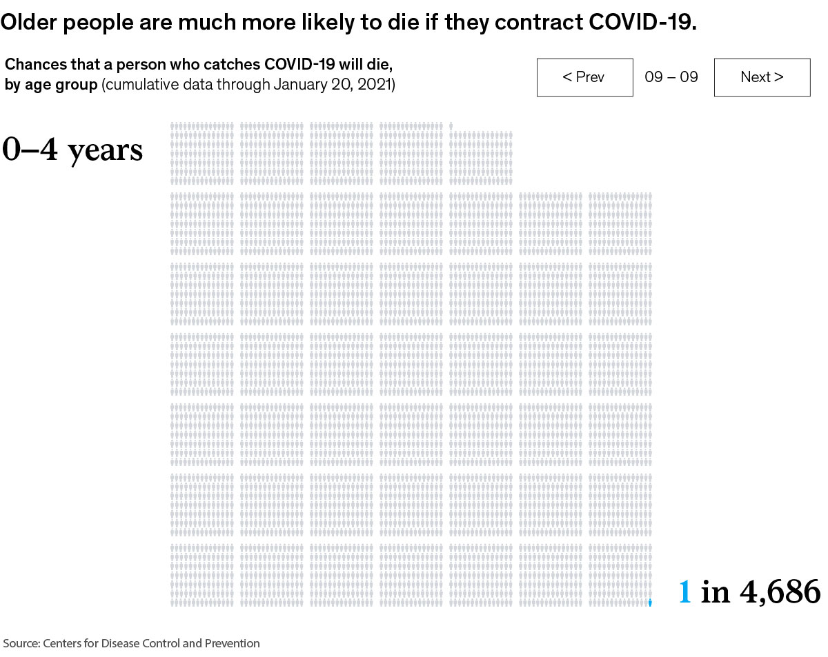
Our Charting the path to the next normal series offers a daily chart that helps explain a changing world—during the pandemic and beyond. In case you missed them, this week’s graphics explored the COVID-19 mortality rate by age group, post-World War II productivity growth, the pandemic’s impact on Black workers’ underrepresentation and pay gaps, climate hazards in South Florida, and choosing the right approach to organizational change.
FEATURED CHART
People over 75 are 1,000 times more likely to die from COVID-19 than teenagers
exhibit: older people are much more likely to die if htey contract covid-19
See more
LinkedIn Twitter Facebook
This week’s other select charts
“Productivity isn’t everything, but in the long run, it is almost everything.”
Two steps back: COVID-19 derails labor-force progress by Black Americans
Too darn hot: South Florida could face 25 more days of swelter each year.
How you change things is just as important as what you change
McKinsey & Company
Follow our thinking
LinkedIn Twitter Facebook
Copyright © 2021 | McKinsey & Company, 3 World Trade Center, 175 Greenwich Street, New York, NY 10007